mirror of
https://github.com/GraphiteEditor/Graphite.git
synced 2026-09-19 19:08:05 +08:00

191 lines
8.4 KiB
Markdown
191 lines
8.4 KiB
Markdown
# GUI System Explainer
|
||
|
||
This directory contains the XML files describing the components which make up Graphite's GUI.
|
||
|
||
## Principles
|
||
|
||
The framework is inspired by [Vue.js](https://vuejs.org/).
|
||
Each component's layout is defined in an XML, and recursively made out of lower-level components.
|
||
|
||
Interactivity is provided by script files which expose reactive variables. As these variables are mutated, the component is updated to match the current state.
|
||
|
||
## Layout
|
||
|
||
The layout engine does a top-down pass through the component tree in order to determine what to render.
|
||
|
||
Layout is controlled using predefined attributes, such as `width`, `height`, `x-align`, `y-align`, `gap` or `padding`.
|
||
|
||
## Component lifetime
|
||
|
||
The children of a component are passed to it as a `children` attribute. For example, looking at the row component:
|
||
```xml
|
||
<row children="INNER_XML: (Layout) = [[]]">
|
||
{{INNER_XML}}
|
||
</row>
|
||
```
|
||
The `children` attribute defines a new variable `INNER_XML` of type `Layout` which can contain more XML layout structure. It has a default value of `[[]]` which refers to an empty layout— XML syntax (for the `Layout` data type) written in a tag's attribute is wrapped in ``[[`` (opening) and `]]` (closing) symbols. In this case the `INNER_XML` variable defaults to empty XML, however it is not strictly useful here because the `children` attribute will always have its value replaced by whatever exists between opening and closing tags when this component is called from elsewhere.
|
||
|
||
This is then expanded in the body of the row: `{{INNER_XML}}`.
|
||
|
||
## Defining new components
|
||
|
||
### Component files
|
||
|
||
To define a new component, create a new `.xml` file in this directory. Subdirectories become namespaces for the components (e.g. the file `window/main.xml` defines a component `<window:main>`).
|
||
|
||
### Parameters
|
||
|
||
User-defined parameters start with a colon (`:`).
|
||
|
||
They are created by adding attributes to a component source file:
|
||
`:parameter="VARIABLE_NAME: (VariableType) = defaultValue"`
|
||
|
||
# GUI System Markup Language Specification
|
||
|
||
## Layouts
|
||
|
||
* XML files laying out interface structure with tags for layouts and primitives
|
||
* Namespaced with folder name like `<namespace:layout-name>`
|
||
* Inner XML content bound to the variable specified in the `children` attribute of the root element definition
|
||
* All custom attributes are prefixed with a `:` when used as arguments and as parameters
|
||
* Root element in each file is the layout and its accepted arguments with a bound variable and default value
|
||
* Templating using {{mustaches}} for bound variables and computed values in the associated script
|
||
* Each layout has a companion script (Rust or WASM) that exposes computed values for templating
|
||
* Each layout acts as a container element used in computing layout measurements
|
||
|
||
## GUI layout tree data structure
|
||
|
||
* Stores purely the data used by the renderer and shaders
|
||
* Updated by the layout system
|
||
|
||
## Primitive layouts
|
||
|
||
**`<box> | <box />`** Draws a box
|
||
* **`children`** *`[xml | none = none]`*
|
||
Inner XML stays in the document
|
||
* **`:fill`** *`[color | none = none]`*
|
||
Fill color for the box
|
||
* **`:round`** *`[size | size size size size = 0px]`*
|
||
Rounds the corners
|
||
* **`:border-thickness`** *`[size = 0px]`*
|
||
Thickness of the border inside the box
|
||
* **`:border-color`** *`[color | none = none]`*
|
||
Color of the border inside the box
|
||
|
||
**`<icon> | <icon />`** Draws an icon from an SVG file and optionally contains child elements
|
||
* **`children`** *`[xml | none = none]`*
|
||
Inner XML stays in the document
|
||
* **`:svg`** *``[string = `missing_svg_alert.svg`]``*
|
||
Location of the SVG file
|
||
* **`:style`** *```[string = ``]```*
|
||
CSS styling to be applied to the SVG, useful for applying templated variables
|
||
|
||
**`<text>`** Draws text
|
||
* **`children`** *```[string = ``]```*
|
||
The text to be drawn (eventually this could become XML for styling)
|
||
* **`:color`** *`[color | none = [middlegray]]`*
|
||
The color of the text
|
||
* **`:size`** *`[size = 12px]`*
|
||
The size of the text
|
||
|
||
**`<row> | <row />`** Wraps content laid out across vertically-adjacent sections, or acts as a spacer
|
||
* **`children`** *`[xml | none = none]`*
|
||
The elements inside the row
|
||
|
||
**`<col>`** Wraps content laid out across horizontally-adjacent sections, or acts as a spacer
|
||
* **`children`** *`[xml | none = none]`*
|
||
The elements inside the column
|
||
|
||
**`<if>`** Conditionally enables or disables child content if :a equals :b
|
||
* **`children`** *`[xml | none = none]`*
|
||
The elements to be shown if :a equals :b
|
||
* **`:a`** *`[TypeValue = true]`*
|
||
The first variable that must equal the second variable
|
||
* **`:b`** *`[TypeValue = true]`*
|
||
The second variable that must equal the first variable
|
||
|
||
## Layout calculation
|
||
|
||
**`width`** *`[Dimension = inner]`*
|
||
Set the exact content width of the element
|
||
|
||
**`height`** *`[Dimension = inner]`*
|
||
Set the exact content height of the element
|
||
|
||
**`x-align`** *`[Dimension::Percent = 0%]`*
|
||
Factor from left (0%) to right (100%) to align content inside this larger element
|
||
|
||
**`y-align`** *`[Dimension::Percent = 0%]`*
|
||
Factor from top (0%) to bottom (100%) to align content inside this larger element
|
||
|
||
**`gap`** *`[Dimension Dimension Dimension Dimension = 0px 0px 0px 0px]`*
|
||
Collapses between neighbors, pushes/expands parent set to inner, not part of click target (negative values count against the interior dimension instead of adding to the outside of the dimension?)
|
||
* **gap** *[Dimension → a a a a]*
|
||
Sugar: Single value for all sides
|
||
* **gap** *[Dimension Dimension = a b a b]*
|
||
Sugar: Two values for top/bottom and left/right
|
||
* **x-gap** *[Dimension = 0px a 0px a]*
|
||
Sugar: Single value for left/right
|
||
* **x-gap** *[Dimension Dimension = 0px a 0px b]*
|
||
Sugar: Two values for left and right
|
||
* **y-gap** *[Dimension = a 0px a 0px]*
|
||
Sugar: Single value for top/bottom
|
||
* **y-gap** *[Dimension Dimension = a 0px b 0px]*
|
||
Sugar: Two values for top and bottom
|
||
|
||
**`padding`** *`[Dimension Dimension Dimension Dimension = 0]`*
|
||
Doesn’t collapse between neighbors, pushes/expands parent set to inner, part of the click target (negative values count against the interior dimension instead of adding to the outside of the dimension?)
|
||
* **padding** *[Dimension → a a a a]*
|
||
Sugar: Single value for all sides
|
||
* **padding** *[Dimension Dimension = a b a b]*
|
||
Sugar: Two values for top/bottom and left/right
|
||
* **x-padding** *[Dimension = 0px a 0px a]*
|
||
Sugar: Single value for left/right
|
||
* **x-padding** *[Dimension Dimension = 0px a 0px b]*
|
||
Sugar: Two values for left and right
|
||
* **y-padding** *[Dimension = a 0px a 0px]*
|
||
Sugar: Single value for top/bottom
|
||
* **y-padding** *[Dimension Dimension = a 0px b 0px]*
|
||
Sugar: Two values for top and bottom
|
||
|
||
**`scroll`** *`[Dimension::Percent = 0%]`*
|
||
When child elements overflow their container, keep them visible on the top/left (0%) or bottom/right (100%) while clipping on the opposite side
|
||
|
||
|
||
## Variables
|
||
|
||
Parameter
|
||
* Attribute: **?: (T1 | … | Tn) = ?**
|
||
Declares a parameter with a list of possible types and a required default value
|
||
* ```^\s*({{)\s*(\w*)\s*(:)\s*(\()\s*(\w*\s*(?:\|\s*\w*\s*?)*)\s*(\))\s*(=)\s*(\w*)\s*(}})\s*$```
|
||
* ```{{ THE_NAME : (bool | color | inner | percent ) = none }}```
|
||
* ```Value Type: (String, Vec<TypeName>, TypeValue)```
|
||
|
||
Argument
|
||
* Attribute: {{?}}
|
||
In an attribute, string, or between tags, evaluates to another type value via environment lookup
|
||
* ```^\s*({{)\s*(\w*)\s*(}})\s*$```
|
||
* ```{{THE_NAME }}```
|
||
* ```Value Type: String```
|
||
|
||
## Types
|
||
|
||
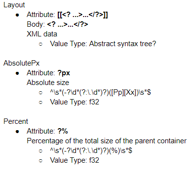
|
||
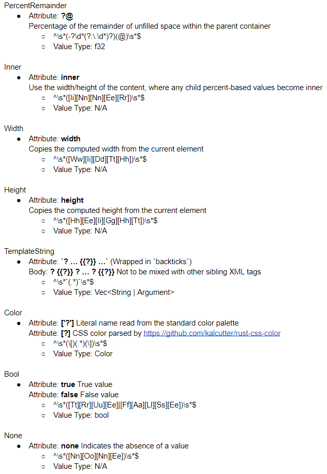
|
||
|
||
## Drawing procedure
|
||
|
||
Depth or breadth first traversal, shallow nodes drawn before deeper nodes
|
||
|
||
## Updating and damaged flag
|
||
For any element marked damaged, it and all its children are redrawn
|
||
Resizing panels marks all affected panel containers as damaged so the resized contents are drawn
|
||
|
||
## Antialiased corners
|
||
|
||
Pass along the parent node’s uniform, for any fragment located within a corner region, render the parent and blend antialiased GUI rectangle over it based on signed-distance function corner
|
||
|
||
Pixels in the corner regions must be wholly from the parent (must live within the borders of the parent, parent can’t be transparent, parent can’t have a wider overlapping border radius)
|
||
|
||
Requires a special case for overlapping parent and child with same border radius in same location so only the child is shown to avoid bleeding doubled antialiased edges
|